Click for movie. High resolution movie available on YouTube.
XRT Flare Imaging History
|
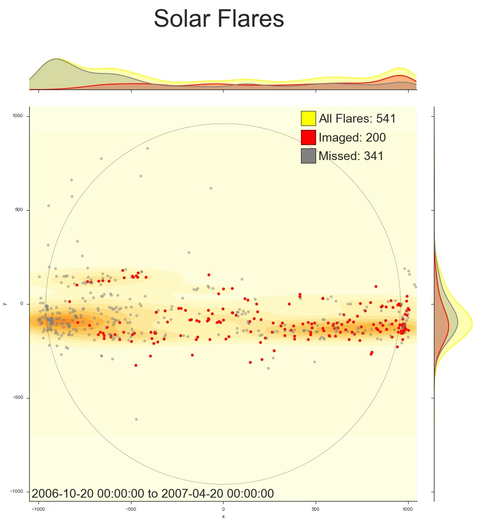
This video shows the flare imaging history of the Hinode XRT over its 9 year lifetime. Each frame depicts the performance of the XRT over a 6 month long "window" into the past. This window shifts forward by one day in each successive frame. A scatter plot details the locations of all B, C, M, and X class solar flares that occurred in the time windows; a red dot represents a flare that was imaged by XRT, while a grey dot represents a flare for which XRT failed to collect any data. A heatmap behind the scatter plot indicates the density of all flares across the disk of the sun, while spline curves on the top and right hand sides of the plot show the distribution of flares that were captured and were missed, as well as the overall total number of flares, in the E-W and N-S directions. The source for the flare locations as well as whether the flares were imaged is the Hinode Flare Catalogue. Note that the XRT tends to miss the highest percentage of flares on the east limb (left hand side, unlike the convention with Earth). This is because active regions move from east to west across the disk of the sun as the sun rotates. This rotation is apparent in the video in the way in which swaths of flares appear from east to west as the active regions responsible for them make their paths across the disk of the sun. If an active region appears on the east limb from behind the sun, the XRT planners are less likely to respond in time to catch any flares that may occur while the region is still on the east limb. In contrast, XRT planners have been keeping an eye on any active regions in the middle or on the right hand side of the disk for some time, and their pointing plans are therefore better at capturing flares that occur in these regions.
This video spans 9 years of solar history, capturing a substantial portion of the 11 year
solar cycle. Note that the quantity of flares decreases as we approach solar minimum in
2008, increasing from there until solar maximum in 2013 and subsequently beginning to
decrease again until present day. Also make note of the locations of the flares: around
solar minimum, flares occur in narrow bands above and below the equator, but, as solar
maximum approaches, these bands widen, covering an expanse that reaches closer to the
poles. One can also observe in this video that the southern hemisphere lags behind the
north in the solar cycle, reaching both its minimum and maximum at later times.
Additionally, keep in mind that the eastern and western limbs of the sun typically have
higher concentrations of flares than the middle because, while the sun is being depicted
as a disk, it is actually a three dimensional sphere. This means that an area on the edge
of the disk corresponds to a larger piece of surface area on the sphere than an area of
the same size on the center of the disk does.
|
(Prepared by Greg Woelki)
| Back | Archive | Next |